

Financial Health Check
Using UX to help people improve their financial health.
Case Study:
Financial Health Check
The Story
The problem of improving one’s financial health is complex. It is part psychological and part mathematical. It is challenging to make sense of how interest works, how loans work, how investing works, and even how to do basic day-to-day budgeting.
To compound this problem, general personal finance and education are often not taught sufficiently in schools. This level of complexity is intimidating and causes people to avoid the effort to self-educate and self-manage their finances.
The Challenge
How Might We empower people who are struggling financially to break the check-to-check cycle, save for the future, and reduce related financial anxieties?
About the Company
BECU is a member-owned, not-for-profit credit union. Meeting member needs is at the core of its business philosophy. As of December 2021, BECU had over $30.2 billion in assets and over 1.3 million members making it the largest credit union in Washington and the fourth largest in the United States.
My Role
In 2020, acting as a lead UX designer and researcher I eagerly joined a unique BECU agile team dedicated to improving the financial health of our membership.
Objective: Limit the need for users to read complex self-help content or make appointments to meet with financial advisors in person by developing a suite of digital tools that do the work of improving financial health at a pace and level that is convenient for them.
Project Kick-off
BECU currently offers a 45-minute phone-based coaching session called the Financial Health Check. Since 2017, this program has seen some success with 4500 completed sessions.
However, there are problems with the current program.
-
It is time-consuming. Taking the time to schedule and conduct a 45-minute session does not fit the busy lives of our financially struggling users
-
It is embarrassing. People are embarrassed to discuss their situations, for example, poor credit and the reasons for it, with live individuals
-
It cannot scale. With a limited number of financial advisors to meet the needs of 1.5 million members, the human-to-human experience is not scalable
Project Vision
This vision was set by our Project Manager and inspired by senior leadership.
“We aim to deliver a suite of member-centric solutions helping members build day-to-day financial capabilities that will both support and improve their financial wellbeing.”
From this.....
To this.....

UX Research: Problem Space
Research Questions
With the vision in place by our Project Manager, and informed by my review of existing research, I crafted these primary research questions.
-
What kinds of assistance are those who are struggling financially looking for when it comes to getting help online?
-
What online tools will expand access to affordable and quality products and services?
-
How effective is an online version of a financial health checkup compared to an in-person financial health check experience?
Early Research
In the early stages of joining the Digital Financial Health Check team (dFHC), the only UX work completed to this point was exploratory research and very basic UI concepts. From here, I took the baton and immersed myself in the existing research, then added in research of my own.
Salient Findings from my Online Research
-
Personal finance is not effectively taught in public schools (source)
-
Financial knowledge gaps impede financial stability (source)
-
40% of Americans don’t have $400 to cover emergencies (source).
-
Financial insecurity traps women in unhappy marriages (source)
-
Poor financial health is linked to poor physical health (source)
-
Financial instability ranks 2nd, and 3rd in areas of worry (source)
Salient Findings from Exploratory Interviews
20 unmoderated interviews were conducted and 2 moderated interviews by my UX predecessor. Those interviews were synthesized into the following key takeaways.
User Pains
-
Low and irregular salaries make planning a challenge
-
Unexpected expenses, like car accidents, and home repairs can wipe out savings
User Needs
-
More income
-
Comfort, stability
-
Financial help must….
-
Have no cost, minimal time investments, and in small incremental steps
-
Be understandable
-
Be transparent
-
Be controllable
-
Not be overwhelming
-
-
Provide for dependents
-
Be an easy way to take action
User Goals
-
Grow income
-
Save for future goals
-
Financial Stability
-
Pay off debt
Research Questions
With this research, a Project Persona was created named Beth.

Competitive Analysis
& Comparative UI
With the user needs now captured, the problem space identified, and design principles crafted, I conducted a competitive analysis of similar offerings online. The objective here was to understand the baseline experience of these offerings, get ideas on how the interface might look, and find gaps in features compared to the needs of our persona, Beth.


Design
Design Principles
At this point, I knew enough about the target user and business needs to craft the project design principles. These acted as a ‘North Star’ I could follow to guide my design efforts.
Confidential & Stigma-free
Our product is non-judgmental regarding the user’s past financial struggles. Once the user gives information to the online financial health check, it will be clear that the data is not stored or used to lead the user to a promotion, trial, or paid product.
Timely
Our product should never disrupt or take any unnecessary time from our users’ lives. It should offer an experience where users can engage at a pace that fits their schedules.
As Helpful as a Human Financial Advisor, Without the Human
Our product’s main priority is to create the helpful aspects of an in-person financial advisor experience, without the client needing to shame themselves by disclosing financial failures to an advisor.
Understandable and Approachable
We believe jargon-free, simple design reduces the intimidation users have when it comes to the subject of personal finance management, investing, or financial education.
The Flow
With a general idea of what the Digital Financial Health Check should be at this point, I created a medium-fidelity flow map that showed the overall build and flow of the tool. This flow map was shared with my agile team and the PO to get alignment.

Low Fidelity
Wire Frames
With the flow map in place, I began to explore how an online digital financial health check might look if it emulated the ‘question and answer’ conversations our BECU financial advisors had with our members.
For this to happen, the interface would need to offer:
-
Selecting Goals: Users tell the system which financial goals they have
-
Answering Questions: Users answer some questions about their current financial health
-
Getting Recommendations: Users receive recommended actions to meet their goals
-
Editing Previous Information: Users can edit previous information
I challenged myself to create at least 5 ways each of the following main features could look before jumping into Figma, shown below.
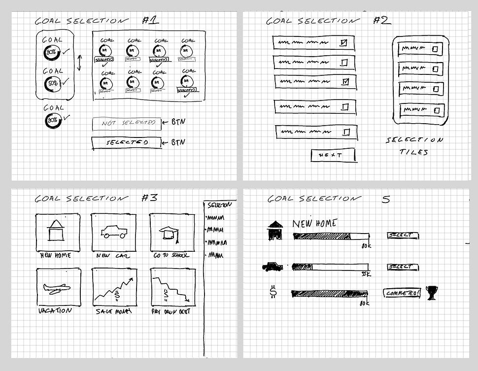
Selecting Goals
Answering Questions

Getting recommendations

Editing Previous Information

Collaboration
with the team
Whenever I design, I make sure I am bringing along my team for the journey. This strategy not only surfaces ideas from a diverse team but also builds a shared understanding of what we are trying to accomplish.
Below is just one example of many ideation and story-mapping workshops I have conducted for this project.

Medium Fidelity
Wireframes
With the low-fidelity sketching workshops completed, I typically move to medium fidelity prototypes and strive to test in usertesting.com before moving on to higher fidelity prototypes.

High Fidelity
Wireframes: Figma
The final state of the wireframe design is done in Figma. The interactive prototype is used for demonstration, usability testing, and accessibility review for both desktop and mobile.

Demo of the Financial Health Check

User Research: Solution space
Usability Testing
With low, medium, and high-fidelity wireframes created, I then proceeded to validate the designs we had crafted through a series of usability testing, tree jack tests, card sorts, and surveys.
In 2022, to date, I have launched and synthesized 12 unmoderated usability studies conducted with 60 users. This effort includes the drafting of a research plan, test script, and companion Figma prototype. This is a screenshot below from one usability study.


Confirming the Work
Findings
Learnings from the usability studies were incorporated into the prototype as they were discovered. Overall, I discovered 36 usability insights that were implemented into the prototype during its development.
Usability issues found and remedied:
-
Users had difficulty navigating back and forth between recommendations and dFHC
-
Remedied with Breadcrumb design
-
-
Users failed to understand why some recommendations were broken out into primary and secondary recommendations
-
Remedied by putting all recommendations in one list
-
-
Users were confused when being dropped right into a digital tool with no instructions
-
Recommended adding a 'Learn More' option
-
Critical Problem: Edit
As the project began to unfold, one of the major challenges we had was when a user returns to edit their work. We initially thought having all of the edit features in one location, similar to a profile edit, would be the ideal way to edit the users' previous information. However, during several rounds of usability studies, I observed that
-
People were clicking on the ellipses (...) to access edit for the goals
-
People were clicking on the area of the prototype to access the specific things they wanted to edit
-
People were not seeing the small universal edit button
-
The one edit screen was too long, making elements hard to find
Before

After

Accessability
Born Accessible
To ensure this project was ‘born accessible’, I was sure to use our design system which I had a hand in creating. In our design system, we have each component validated for proper contrast and annotated to denote tabbing order.

IAAP Certified in Accessability
Accessibility is an area that I am working to improve. In that effort, in 2022 I passed the IAPP - Certified Professional in Accessibility Core Competency (CPACC) exam making me one of 1,1769 CPACCs worldwide. This was a very challenging exam that I studied for over six months.

The Future
A Financial Hub
This work will be launched by Q2 of 2023. We are currently working on a complete financial health hub, where this tool will be used to usher users through a guided financial health improvement journey to reach their financial health goals.
Financial Hub Concept
